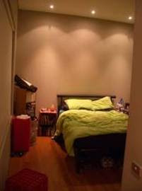
 I just wanted to see how photos look on a blog entry. So, what if I was to show you my bedroom, and the first design decision, to place the bed against the backwall?
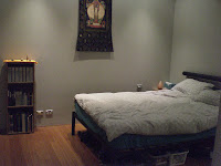
And then, inspired by my pal Daniel’s redesign and declutter of my front room, I realised that while it made “sense” to put the bed there – since there were powerpoints on each side of the bed, convenient for bedside lamps and such – that having the bed in this position didn’t allow me to take advantage of possibly the best feature of the room, the view! Lying in be d, I couldn’t look out the window at the lovely city view. But I discovered something better, which was that by moving the bed against the other wall, there was somehow a lot more room in the bedroom, and that it opened the view down the hallway. Instead of seeing the bed and the other crap, I could make it clear and open! Also, helped by putting laundry baskets in the closet, getting rid of milk crates and generally tidying. But it looks much better, don’t you think?
